COVID-19: A Tale Of Three Regions
Authored by Yves Smith via NakedCapitalism.com,
This look at Covid-19 data shows how one needs to be modest in reaching conclusions, since much of the information bandied about (most importantly, confirmed cases) is of dubious quality and not comparable across countries.
Nevertheless, I’d add one consideration to the list: the stringency of the various “quarantines”. China’s was very tough, with people in cities not allowed to leave their apartment buildings if a temperature reading at the entrance showed a fever. It is an open question as to whether our halfway measures (closures of lots of businesses but no restriction on movement of people) will be good enough.
By Ignacio Moreno Echanove, an epidemiologist…
I am analyzing the evolution of Covid-19 epidemics in three different regions of the world, identify the differences we can find, and speculate on how the disease spreads differently in these regions. The three regions are examples of full-blown epidemics managed with quarantines (mitigation).
I have not included data from South Korea since that can be considered a case of clever management during the contention phase.
The three regions are:
-
the province of Hubei (China Popular Republic, 58 million inhabitants) where all started,
-
Italy (61 million) the country showing so far the highest toll, and
-
Spain (47 million), following Italy’s path with a short lag in the development of the Covid-19 epidemics.
I hope to provide some light in the development of the epidemics and provide a few hints on what to expect in other regions where the epidemics are developing now with some lag.
First, as a tracker of the epidemics, I don’t follow the number of confirmed cases as reported by every country. This number is in my opinion useless to track the disease for various reasons. I don’t want to belabor this argument but to have an idea of how an epidemic developed, what is needed is the testing of random samples large enough to give a significant number of positives that are representative of the true geographic distribution of the epidemic. In the early days of the epidemics this would be difficult and requires… what South Korea and South Korea alone has done.
There is an instrument that is used to track the epidemics of influenza, which very useful to decide each season what vaccines to choose (FLUNET). It may be have been diverted by some governments to track Covid-19 epidemics. I would certainly do so if I were in a position of authority! If has happened, it has not been publicly acknowledged as far as I can tell. However, according to a report from the WHO, this was done at least in Guangdong province in China.
Instead of confirmed cases I prefer to track the sad number of Covid-19 associated casualties. Mi hypothesis is that Covid-19 casualties are a much better reflection of the true extent of the epidemics. Probably very few are missed in reports and the cumulative number is an indirect indicator of the number of total contagions that had occurred in between 20-30 days before reflected the mortality data.
Remember that symptoms appear at about 5 days and disease development takes 2 weeks for mild cases and three for the severe cases. Cumulative casualties is a lagging indicator of course but after all more representative than reportedly confirmed.
The next graph shows the cumulative number of casualties in the three regions but synchronized starting the day when 6-8 cases had been reported in each region. The dates in the horizontal axis are valid for Hubei. Data for Hubei starting 21st Jan is from JHI web as reported by the WHO. Data for Italy (starting Feb 24th) and Spain (starting March 8th) are from Wikipedia. The initial lags are 35 days between Italy and Hubei and 13 days between Italy and Spain. The arrows indicate the starting day for general quarantines in each region. A blue ray (¿?) indicates the day when Hubei epidemics showed an inflection with daily casualties declining sharply: 31 days after quarantine start.
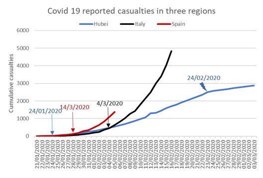
The Hubei epidemic is the only that so far shows the shape of a logistic curve, though compared with those of Italy and Spain looks nearly linear. It can be seen that the number of casualties dropped sharply on Feb 24th, coincidentally the first epidemic day shown in the graph for Italy. This sustained drop started 31 days after the start of the general quarantine. According to Zhou et al., (https://www.thelancet.com/journals/lancet/article/PIIS0140-6736(20)3056…) the median duration of Covid disease in severe cases is 20 days after symptom onset but on non-surviving patients median time to death is about 18.5 days.
In these curves the shape of the logistic curve will depend on the date of general quarantine start resulting in sharp reduction of R0 and the development that should show up at about 5 days incubation period plus 19 days to death for a total of 24 days. The drop in Hubei, 31 days after quarantine start, exceeded by 6 days that of the disease development and it can be speculated that it could be due to chaos in the beginning of the quarantine, a spike in home contagions and some statistical mess. I would expect that this time “to sharp reduction of daily fatalities” could be somehow shorter in Italy and Spain. My experience is that the effect of emergency measures was quite sharp in Spain and I think it was the same in Italy after the Chinese experience. So one could expect to see some relief in Italy by the 31st of March and in Spain by the 10th of April, regarding the numbers of reported fatalities. I will refrain to project current trends publicly until those target dates but looking at the graph it is possible to understand that it can be quite horrible.
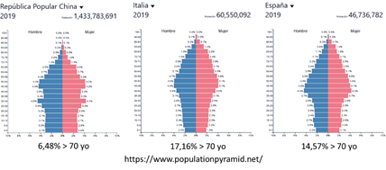
The starkest difference between these three curves is the slope of the regression, related with overall mortality rates. The slope is so far as twice as large for Spain (we have not seen the peak) and about four times larger for Italy. Why is this? One reason, given that the mortality rates are much higher for the elder, could be differences in the population pyramids of the three regions. Next graph shows a comparison of these pyramids that demonstrates the distribution of ages is less favourable for Italy or Spain. In particular there is a sharp difference in the proportion of 70 years old and elderly which is more than twice as large for Italy or Spain compared with China (assuming the distribution in China is representative of Hubei).
If this is the main reason explaining differences in slope, I would expect the slope in Spain would be somehow lower than the Italian one.
Another possible factor could be that quarantines were decreed in different moments on the evolution of the epidemics. The sooner, the lower slope. In this case Italy is again the worst case (11 days delay compared to Hubei) followed by Spain (4 day delay). These two reasons combined could explain the differences seen so far.
A third difference is that the exponential growth of the epidemics starts somehow sooner in Spain compared with Italy or Hubei by about three days. A possible explanation for this is that while in Italy and Hubei only one cluster was detected in the beginning, in Spain two clusters were simultaneously seen, one in Madrid and the second in the Basque Country. So, Spain is a tale of two close epidemic outbreaks. In my opinion those clusters expanding so fast out of control may have a common element: the so-called “superspreaders”.
These stories suggest a few things to be considered in other ongoing epidemics and for the future.
1) If “superspreaders” are involved in sudden outbursts, containment measures should account for this possibility and provide for intensive and extensive testing of the population around any given case. This could explain the South Korean success. In other examples where the epidemics still looks linear in the absence of such extensive testing, it may be the fortunate case that so far, no superspreaders have surfaced. Perhaps there was an undetected superspreader in Washington state. In France, UK or NY, the increasing numbers may be related with many individual contacts with Italy and now Spain (or Iran, SK) rather than a superspreader. The differences between NY and CA may reflect less direct contact with Europe in the latter case.
2) When containment has failed and uncontrolled spread is seen, the sooner quarantines are decreed, the better.
3) Other differences can be related with the intensity of social relations in large metropolitan areas like Wuhan in Hubei or Madrid in Spain (and presumably NYC?). Madrid accounts for about 60% of casualties in Spain. I think that NYC is now making a big effort to test everybody and this is good though a bit too late now.
4) Last but not least, the proportion of vulnerable people in a country will almost certainly affect overall mortality and contribute positively or negatively to the slope of the curve.
Tyler Durden
Mon, 03/23/2020 – 12:30